As part of your data wrangling process you’ll probably need to quickly aggregate and visualize your data, so you can make sense of it, specially when working with huge data sources.
In today’s tutorial we’ll leverage several Python libraries to create some simple pie charts that will help you better document and visualize your analysis.
Pie Charts with Python
In this and other examples, we’ll use a fictitious deliveries dataset. If you would like to follow along through the analysis below, you can download the deliveries dataset from this location.
Let’s get started by importing the Python data analysis libraries into our environment.
#Python3
import pandas as pd
import matplotlib.pyplot as plt
import seaborn as sns
%matplotlib inline
sns.set()
Now we’ll acquire the Deliveries dataset.
#import the deliveries data into a Pandas dataframe
#it is assumed that the dataset is saved in the same directory of your notebook
deliveries = pd.read_csv("deliveries.csv")
We’ll now going to look into the DataFrame header, to get familiar with the data:
deliveries.head(3)| type | time | day | order_amount | del_tip | |
|---|---|---|---|---|---|
| 0 | Food | Afternoon | TUE | 32 | 4 |
| 1 | Food | Night | WED | 46 | 6 |
| 2 | Medicines | Morning | TUE | 41 | 0 |
Simple Charting in Pandas
For this example, we would like to analyze the tips our delivery drivers received for the different delivery areas (Food, Medicine etc’). We have acquired the data, so we can move on to some data visualization.
#groupby the data by delivery type
data = deliveries.groupby("type")["del_tip"].sum()
data
type Food 12 Gear 15 Groceries 13 Medicines 18 Name: del_tip, dtype: int64
Now we are able to use the Matplotlib engine embedded in Pandas to quickly show a pie plot:
data.plot.pie(autopct="%.1f%%");Here’s the rather simple chart we got:
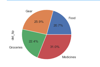
Note the use of autopct which allows us to format the percentage string, so we can show the precise percentage values.
Example of Matplotlib Pie Charts
That was pretty easy. Let’s now use Matplotlib to make something a bit more fancy here:
#Using matplotlib
pie, ax = plt.subplots(figsize=[10,6])
labels = data.keys()
plt.pie(x=data, autopct="%.1f%%", explode=[0.05]*4, labels=labels, pctdistance=0.5)
plt.title("Delivery Tips by type", fontsize=14);
pie.savefig("DeliveryPieChart.png")
The result looks a bit cleaner now:
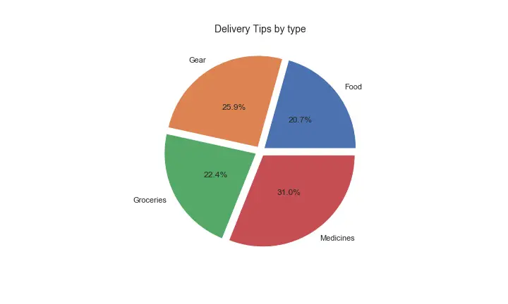
We added a title and also exploded the pie for clarity. Lastly, we used the plt.savefig() method to export the chart as a graphic file to be used in a presentation or uploaded to a web page.
Can we have Seaborn pie charts?
Pie charts are not directly available in Seaborn, but the sns bar plot chart is a good alternative that Seaborn has readily available for us to use.
As we don’t have the autopct option available in Seaborn, we’ll need to define a custom aggregation using a lambda function to calculate the percentage column.
Using the data from the previous example:
data_per = data.groupby('type').agg(percentage =('del_tip', lambda p: p.sum() / data.sum() * 100)).round(2)We’ll then use the Seaborn library to render a barplot:
#Seaborn barplot
sns.set_style("whitegrid")
bar,ax = plt.subplots(figsize=(10,6))
ax = sns.barplot(x=data_per.index, y='percentage', data=data_per, ci=None, palette="muted",orient='v', )
ax.set_title("Pie chart approximation in Seaborn - Total Tip by Delivery Type", fontsize=15)
ax.set_xlabel ("Delivery Type")
ax.set_ylabel ("Percentage")
# calculate the percentages and annotate the sns barplot
for rect in ax.patches:
    ax.text (rect.get_x() + rect.get_width() / 2,rect.get_height(),"%.1f%%"% rect.get_height(), weight='bold' )
bar.savefig("Seaborn_Pie_Chart.png");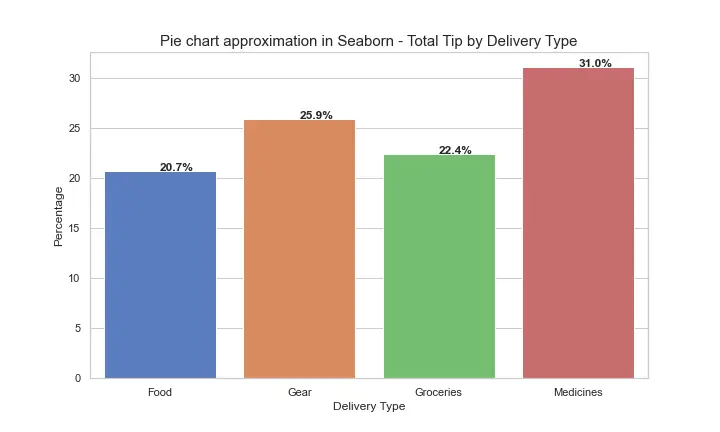
Result is not exactly a pie chart, but useful to show the distribution by percentage:
Note: If you are just beginning with Matplotlib/Seaborn then adding labels to barplots patches in Seaborn is not a trivial task, suggest to look into the “for” loop i implemented to accomplish that.
Here’s a variation, the key difference is the fact we are using an horizontal chart (so obviously had to tweak the locations of the data labels accordingly):
#Seaborn Horizontal barplot
sns.set_style("whitegrid")
bar,ax = plt.subplots(figsize=(10,6))
ax = sns.barplot(x="percentage", y=data_per.index, data=data_per, ci=None, palette="muted",orient='h' )
ax.set_title("Pie chart approximation in Seaborn - Total Tip by Delivery Type", fontsize=15)
ax.set_xlabel ("Percentage")
ax.set_ylabel ("Delivery Type")
for rect in ax.patches:
    ax.text (rect.get_width(), rect.get_y() + rect.get_height() / 2,"%.1f%%"% rect.get_width(), weight='bold' )
bar.savefig("Seaborn_Bar_Vertical.png");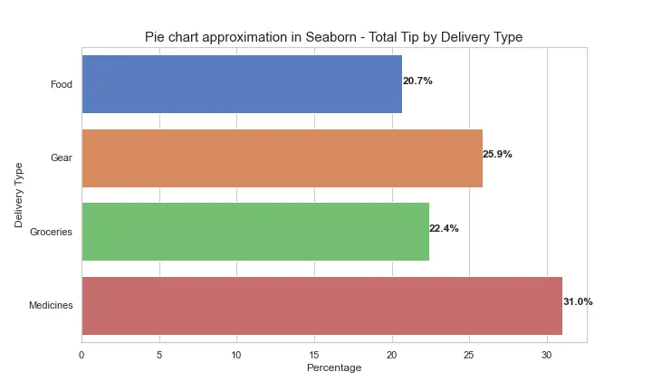
If you are just beginning with Seaborn, you might want to take a look at our detailed examples on countplots and histograms that you can create in Seaborn.