In this quick recipe we’ll learn how to define axis limits for our Seaborn and Matplotlib plots in Python.
For convenience, I’ll use Seaborn in this example, but the methods we’ll use in order to resize the axis limits are first and foremost part of Matplotlib and can be used on every pyplot chart.
Use Seaborn xlim and set_ylim to set axis limits
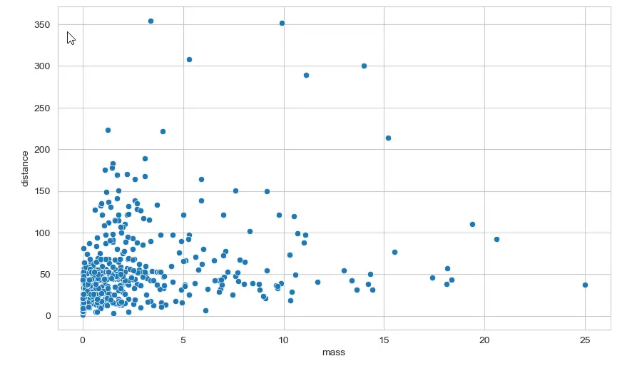
Consider the following code that will render the simple scatter plot we see below.
fig, scatter = plt.subplots(figsize = (10,6), dpi = 100)
scatter = sns.scatterplot(x = 'mass', y ='distance', data=data);
Seems that except a few outliers, we can probably focus our data analysis on the bottom left part of our sns.scatter plot chart.
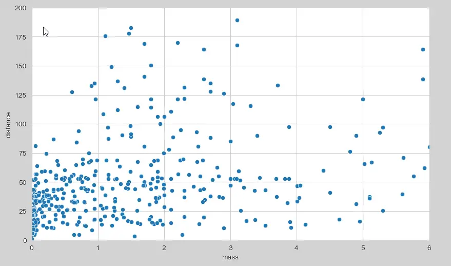
If that is the case, we can go ahead and redefine new limits for both axes in our plot using the following script.
# with xlim/ylim
fig, scatter = plt.subplots(figsize = (10,6), dpi = 100)
scatter = sns.scatterplot(x = 'mass', y ='distance', data=data)
scatter.set_xlim(left=0, right=6)
scatter.set_ylim(bottom=0, top=200);
Here’s our chart, note the new range limits for both the X and y axes. Note that for better clarity you might want to resize your Seaborn plot as needed.

Important Note: Although we used an sns.scatterplot as an example, all the above works on the other Seaborn charts: boxplot, barplot, catplot, lineplot etc’
Follow up questions? Happy to answer your comments.
With relplot I get:
“AttributeError: ‘FacetGrid’ object has no attribute ‘set_ylim'”
But it works with:
“my_plot.set(ylim=(0, 300))”