In today’s tutorial we would like to run through a detailed end to end example of Seaborn countplots creation and customization. We’ll be using our deliveries DataFrame as an example. You can grab the file from this location.
Step 1: Import thew example dataset
#Python3

import seaborn as sns
import pandas as pd
import matplotlib.pyplot as plt
sns.set_style('whitegrid')

# Read the dataset into a Pandas DataFrame
deliveries = pd.read_csv('../../data/deliveries.csv')
Step 2: Create a Seaborn Countplot chart
We’ll start by rendering the countplot:
# define the figure and plot; modify the countplot figure size
countplt, ax = plt.subplots(figsize = (10,7))
ax =sns.countplot(x = 'day', data=deliveries)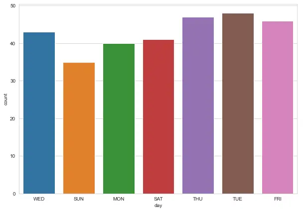
Note: Use the figsize parameter to control the countplot proportions, width and height of our figure. Here’s a more detailed post and information on customizing Seaborn plot figsize.
Step 2: Associate a custom Seaborn palette
We can easily associate a predefined Seaborn palette to our plot.
# set countplot palette
ax =sns.countplot(x = 'day', data=deliveries, order = day_order, palette='pastel' )
Step 3: Add titles to the plot and axes
Our chart doesn’t make much sense without titles. We’ll use the plt.set_title and plt.set_xlabel methods to add titles to our plot.
# Chart and axes titles
ax.set_title('Daily Deliveries',fontsize = 18, fontweight='bold' )
ax.set_xlabel('Day', fontsize = 15)
ax.set_ylabel('Delivery count', fontsize = 15)
countplt
Step 4: order of x-axis labels in Countplots
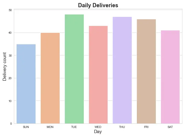
As you can see above, the current order of the x-axis ticks doesn’t make much sense. Let’s modify that.
# change order x axis + change pallete
day_order = ['SUN','MON','TUE','WED','THU','FRI','SAT']
countplt, ax = plt.subplots(figsize = (10,7))
ax =sns.countplot(x = 'day', data=deliveries, order = day_order, palette='pastel' )
Let’s take a look at our chart.
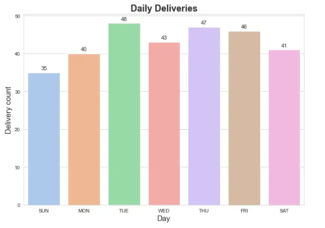
Step 5: Show count in Seaborn countplots
A nice addition to our chart would be the ability to show the value count for every bar.
Here’s a simple code that uses plt.text() to annotate the count values on top of our plot.
# show count (+ annotate)
for rect in ax.patches:
    ax.text (rect.get_x() + rect.get_width()  / 2,rect.get_height()+ 0.75,rect.get_height(),horizontalalignment='center', fontsize = 11)
countplt
Looking good:
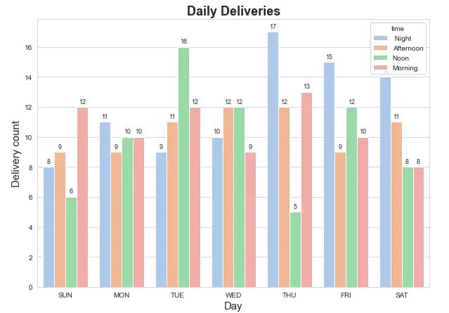
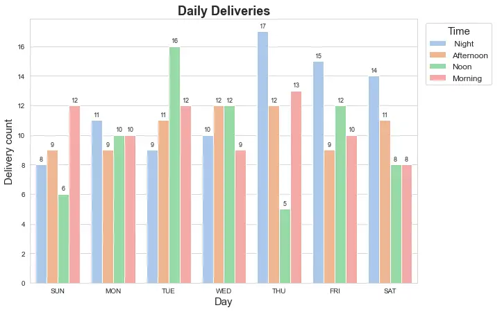
Step 6: Multiple categorical columns in sns countplot
We now want to show the usage of the hue parameter of sns.countplot() to achieve a categorical drill down of our delivery data.
# categorical countplot - show multiple columns
countplt, ax = plt.subplots(figsize = (10,7))
ax =sns.countplot(x = 'day', data=deliveries, order = day_order, palette='pastel', hue='time')
ax.set_title('Daily Deliveries',fontsize = 18, fontweight='bold' )
ax.set_xlabel('Day', fontsize = 15)
ax.set_ylabel('Delivery count', fontsize = 15)
for rect in ax.patches:
    ax.text (rect.get_x() + rect.get_width()  / 2,rect.get_height()+ 0.25,rect.get_height(),horizontalalignment='center', fontsize = 9)
Let’s take a look:
Step 7: Add the legend to the countplot
As can be seen above, the plot legend is overlapping with the top right of the chart. We would like to place the legend outside the countplot. We’ll use the bbox_to_anchor parameter to define a bounding box for the chart legend.
#countplot legend outside the chart
ax.legend(fontsize = 12, \
               bbox_to_anchor= (1.01, 1), \
               title="Time", \
               title_fontsize = 15);
countplt
Here’s the result:
Note: For more information about chart legend customization, check out our comprehensive tutorial on Seaborn legends.