As part of your data wrangling and visualization process you might need to use line plots. In today’s tutorial we’ll see how you can use the Pandas and Seaborn libraries in Python to creating professional looking plots that you can share with your colleagues and management.
Create Lineplot in Seaborn
We’ll first setup or Python data visualization environment by importing Pandas, Matplotlib and Seaborn into our Jupyter notebook.
import pandas as pd
import matplotlib.pyplot as plt
import seaborn as sns
%matplotlib inline
sns.set_style("whitegrid")
Then read our testing data into a Pandas DataFrame.
deliveries = pd.read_csv("../data/deliveries.csv")Then let us take a look at our data:
deliveries.head(3)| type | time | day | order_amount | del_tip | |
|---|---|---|---|---|---|
| 0 | Food | Afternoon | TUE | 32 | 4 |
| 1 | Food | Night | WED | 46 | 6 |
| 2 | Medicines | Morning | TUE | 41 | 0 |
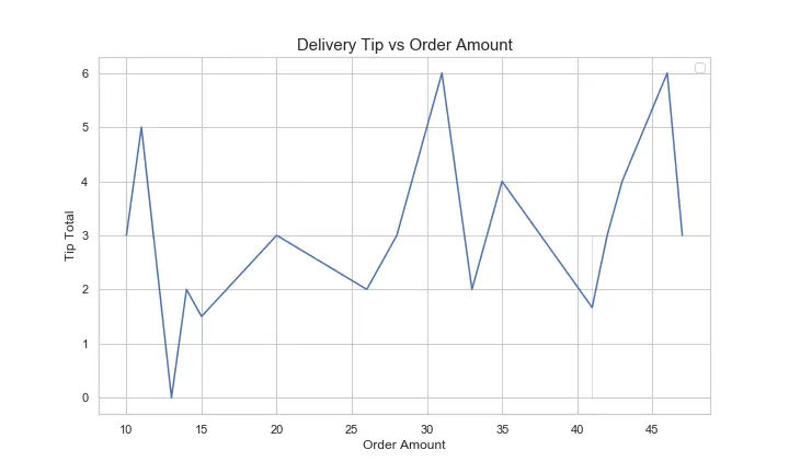
Next, we will go ahead draw a simple sns.lineplot to analyze the delivery tips vs the order amount. Here we go:
line,ax = plt.subplots()
ax = sns.lineplot(x="order_amount", y="del_tip", data=deliveries);
Seaborn lineplot title with set_title()
Let’s now go ahead and add a title to the chart and label the x and y axes accordingly.
ax.set_title("Delivery Tip vs Order Amount", fontsize=15)
ax.set_xlabel ("Order Amount")
ax.set_ylabel ("Tip Total")
Seaborn Lineplot legend
We’ll go ahead and set the location to the upper right. We can as well position the legend outside the plot.
ax.legend (loc="upper right");Set the Lineplot size in Seaborn
The figure we got is a bit small, so we would like to resize it appropriately using the figsize parameter.
# figsize defines the line width and height of the lineplot
line,ax = plt.subplots(figsize=(10,6))
Setting the line style
Seaborn allows to modify the plot line styles according to a grouping variables – in our case we chosen the day variable.
ax = sns.lineplot(x="order_amount", y="del_tip", data=deliveries, palette="pastel", style='day')Lineplot chart with colors
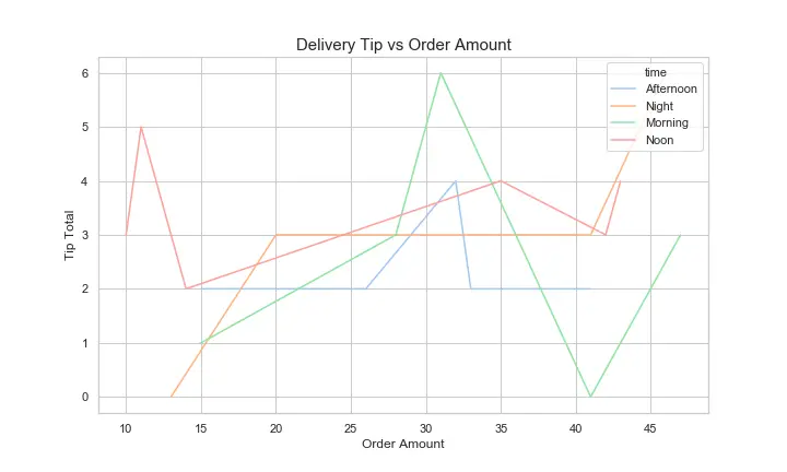
Let’s make our plot a bit more colorful by applying the pastel palette available in Seaborn. The style changed the line color and the chart background.
line,ax = plt.subplots(figsize=(10,6))
ax = sns.lineplot(x="order_amount", y="del_tip", data=deliveries,palette="pastel", hue="time")
ax.set_title("Delivery Tip vs Order Amount", fontsize=15)
ax.set_xlabel ("Order Amount")
ax.set_ylabel ("Tip Total")
ax.legend (loc="upper right");
line.savefig("simplelineplotChart.png");
Change the line width
You can also map the width of your plot lines according to a grouping variable.
ax = sns.lineplot(x="order_amount", y="del_tip", data=deliveries, palette="pastel", size='day')Change the marker size
You can modify the plot marker properties using the matplotlib.markers module. In this example we also modified the marker overall height and width.
ax = sns.lineplot(x="order_amount", y="del_tip", data=deliveries, marker= 'v', markersize=14)Remove the chart legend
Last, we would like to remove the legend from the chart. You can do it by removing the hue parameter from the sns.lineplot definition; or alternatively, you can still maintain the categorical color encoding, and just suppress the legend with the legend=False parameter.
ax = sns.lineplot(x="order_amount", y="del_tip", data=deliveries,palette="pastel", hue="time", legend=False)