In today’s recipe we’ll learn about Seaborn title objects for charts and axes. We’ll see how we can quickly set and change them and apply some customization to improve your Python charts look and feel.
Using set_title to add a title to your chart
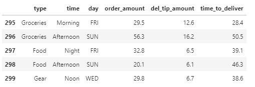
Seaborn leverages the Matplotlib plt.set_title method to define your chart title content and properties. Let’s assume that we have loaded a DataFrame named deliveries that is already populated with data for visualization and further analysis.
Let’s use Seaborn to draw a very simple barplot that we’ll use in this example. Use the code posted below:
import seaborn as sns

labels = ['SUN', 'MON', 'TUE', 'WED', 'THU', 'FRI', 'SAT']

fig, bar = plt.subplots(figsize = (11,7))
bar = sns.barplot(data = deliveries, x = 'day', y = 'del_tip_amount', hue='time', order = labels)
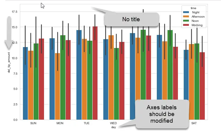
Here’s the simple bar chart we got:

We’ll use the add a title to the chart and also customize the axes labels. The axes.set_title method, allows to specify a title name.
fig, bar = plt.subplots(figsize = (11,7))
bar = sns.barplot(data = deliveries, x = 'day', y = 'del_tip_amount', hue='time', order = labels)
bar.set_title('Average tip per shift')
How to enlarge fonts in Seaborn charts?
We can adjust font size and style quite easily. In this example we’ll use the fontdict parameter to pass a dictionary with the required font styles:
bar.set_title('Average tip per shift',fontdict= { 'fontsize': 24})Setting the fontsize parameter for the axes labels, as shown in the next section, allows to scale the font properties.
Bold Seaborn fonts
You can easily bold your title wording by using the fontweight property.
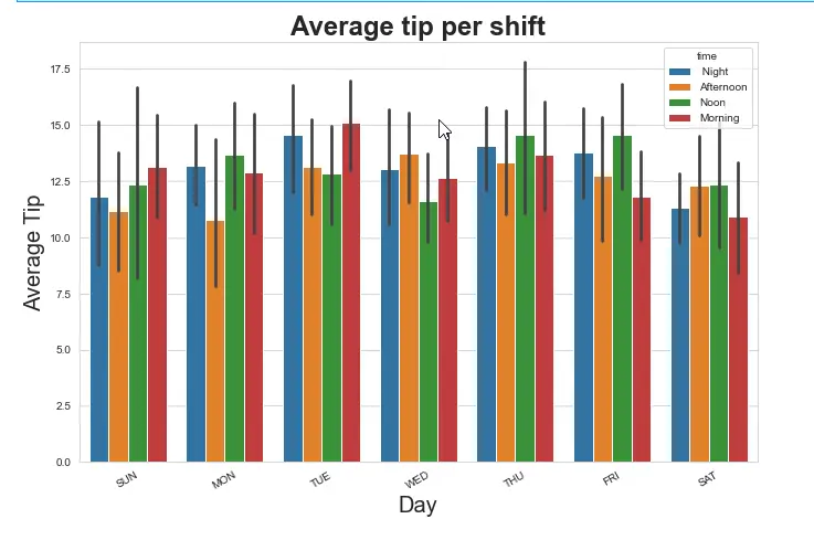
bar.set_title('Average tip per shift',fontdict= { 'fontsize': 24, 'fontweight':'bold'})
Use set_xlabels to set Label titles
Next we’ll also modify both label accordingly:
bar.set_xlabel('Day',fontsize = 20, )
bar.set_ylabel('Average Tip',fontsize = 20 )
bar.set_xticklabels(labels, rotation=30 );- We first format the x and then the y label.
- Finally, we specify a small angular rotation of the xthicklabels for better readibility
Change title position / location in Seaborn
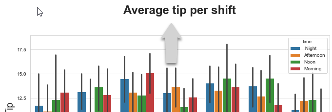
Let’s assume that we would like to make some gap between the title text and our chart.
The Axes. set_title method from Matplotlib, can be leveraged to modify your title position in Seaborn.
bar.set_title('Average tip per shift',fontdict= { 'fontsize': 24, 'fontweight':'bold'}, y =1.1)In this example we have modify the y value, the result look as following. You can apply the ame logic for your axis label titles.


is there a way to make hue=’time’ in the legend bold ?