In today’s recipe we’ll learn about how to quickly draw barplots to analyze data which we already acquired into a Pandas DataFrame.
We’ll look into several scenarios:
- Simple bar chart
- Using groupby to summarize values in our chart.
- Horizontal and Stacked Charts
- Formatting options: color maps, titles, font sizes, labels, etc’
Data Preparation
Let’s start by creating a fictional dataset that we’ll be using throughout the example.
# Import Pandas
import pandas as pd

# Define the data columns
area = ['North', 'South', 'West','Midwest']
target = [17270, 10860, 15390, 15191, 15734, 16265, 10466, 14426]

# Create Dataframe
budget = pd.DataFrame({"quarter": [ 1, 3, 3, 3, 2, 4, 4, 4],
                    "area":area * 2,
                     "target": target})
Drawing a simple bar Chart
The pandas library encapsulates enough capability from Matplotlib to allow us to quickly create simple charts.
# create a pandas Bar plot
budget.plot(x ='area', y='target', kind='bar', cmap='Accent');
Here’s the result:
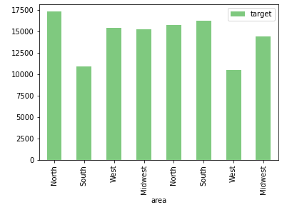
Unlike Seaborn, pandas doesn’t automatically group values. If we want to see the target by area, we need to first group the values.
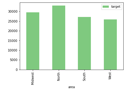
Pandas barplots with Groupby
Let’s use the groupby method to summarize the sales by area:
budget_by_area = budget.groupby('area').agg({'target':'sum'})
budget_by_area.plot(kind='bar', cmap='Accent');
Here’s the result
Horizontal bar charts
In order to change the orientation of our bar chart, let’s modify the value of the kind parameter of the plot DF method to barh.
# Horizontal bars
budget_by_area.plot(kind='barh', cmap='Dark2');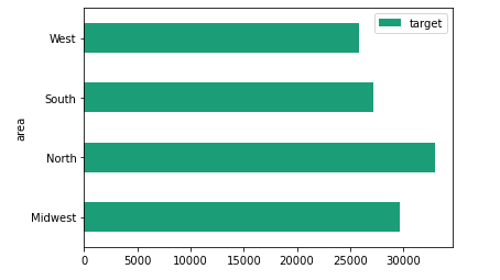
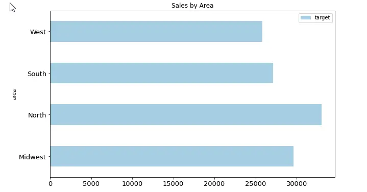
Basic Formatting options
Using colormaps
As shown above we have been using the cmap parameter to assign colormap to our chart
Modifying the size (height / width)
What if we would like to increase the chart sie in our notebook? Using the figsize parameter we can pass a tuple that has the width and height of the chart figure
budget_by_area.plot(kind='barh', cmap='Dark2', figsize= (10,6));Adding a title to your plot
budget_by_area.plot(kind='barh', cmap='Dark2', title='Sales by Area')Changing the labels font size
budget_by_area.plot(kind='barh', cmap='Dark2',fontsize = 13)Bringing it all together
budget_by_area.plot(kind='barh', cmap='Paired', figsize= (10,6), title='Sales by Area',fontsize = 13);|