One of the most basic charts you’ll be using when visualizing uni-variate data distributions in Python are histograms.
In today’s post we’ll learn how to use the Python Pandas and Seaborn libraries to build some nice looking stacked hist charts.
As we typically do, we’ll use our deliveries dataset to explain the concepts in this tutorial. You can download the dataset from here in order to follow along.
Creating data and plotting Pandas histograms
Let’s start with setting our environment:
#python3
import pandas as pd
import seaborn as sns
sns.set()
We’ll use the Pandas library to build our DataFrame by importing our deliveries csv file.
Note: In your project folder, create a subfolder named data and place the deliveries csv there.
#create the deliveries DataFrame

deliveries = pd.read_csv("../data/deliveries.csv")
Let’s take a look at the DataFrame tail, to show the three last rows.
deliveries.tail(3)| type | time | day | order_amount | del_tip | |
|---|---|---|---|---|---|
| 17 | Medicines | Noon | MON | 43 | 4 |
| 18 | Groceries | Afternoon | TUE | 15 | 2 |
| 19 | Groceries | Morning | TUE | 31 | 6 |
Let’s analyze the frequency of the different tip amounts our delivery drivers received.
We can do it very simply in Pandas:
# using Pandas built in hist method.
deliveries["del_tip"].plot.hist();
The grid background is obtained using the sns.set() command we run at the beginning of our code. The chart looks fine, but we can for sure do better.
Seaborn Histograms with sns.histplot
Let’s now improve our plot chart with Seaborn.
- We’ll first set the chart style to white.
- Then we showcase how to use the histplot chart type to plot the delivery tips data.
- Then, we’ll set the x/y axes labels and chart title and increase the font size.
- Last we’ll save and export our chart as a png file, so it can be used in a presentation or web page.
Here’s the Python code:
sns.set_style("white")
hist, ax = plt.subplots()
ax = sns.histplot(deliveries["del_tip"], kde=False)
ax.set_xlabel("Delivery Tips")
ax.set_ylabel("Frequency")
ax.set_title("Histogram of Delivery Tips", fontsize=14)
hist.savefig("DeliveryHistogram.png")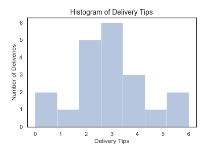
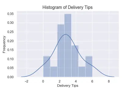
Now let’s look into the relative frequency of each observation.
sns.set_style("white")
hist, ax = plt.subplots()
ax = sns.histplot(deliveries["del_tip"], bins=7, hist="true")
ax.set_xlabel("Delivery Tips")
ax.set_ylabel("Frequency")
ax.set_title("Histogram of Delivery Tips", fontsize=14)
hist.savefig("DeliveryHistogram_Freq.png")
Here’s the result:
Horizontal/ Vertical Histograms
Let’s now tweak a bit our code to turn our Seaborn histogram upside down:
sns.set_style("white")

hist, ax = plt.subplots()
ax = sns.distplot(deliveries["del_tip"], bins=7, hist="true",vertical="true")
ax.set_xlabel("Frequency")
ax.set_ylabel("Tips")
ax.set_title("Vertical Histogram of Delivery Tips", fontsize=14)
hist.savefig("DeliveryHistogram_Freq_Vert.png")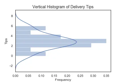
Seaborn Histplot bins
You can easily change the number of bins in your sns histplot. Use the parameter bins to specify an integer or string. You can use the binwidth to specify your default bin width.
sns.set_style("white")
hist, ax = plt.subplots()
ax = sns.histplot(deliveries["del_tip"], bins=7, hist="true")

# alternatively
sns.set_style("white")
hist, ax = plt.subplots()
ax = sns.histplot(deliveries["del_tip"], binwidth=1.1, hist="true")
Multiple Seaborn Histograms on same chart
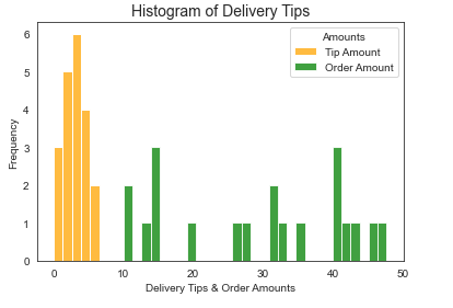
We would now like to show you how you can draw several histograms on the same chart. To make the chart more readable we defined a bar color for each variable, we also added a simple legend as shown below.
sns.set_style("white")
hist, ax = plt.subplots()
ax = sns.histplot(deliveries["del_tip"], kde=False,binwidth=1.3, color = 'orange', label = 'Tip Amount')
ax = sns.histplot(deliveries["order_amount"], kde=False,binwidth=1.3, color = 'green', label = 'Order Amount')
ax.legend(title='Amounts');
Here’s the resulting plot: