In today’s quick tutorial we’ll cover the basics of labels rotation in Seaborn and Matplotlib. For convenience examples will be based on Seaborn charts, but they are fully relevant to Matplotlib.
Here’s a Python snippet that builds a simple Seaborn barplot (sns.barplot). I assume that you have already imported Matplotlib and / or Seaborn to your Jupyter notebook beforehand.
labels = ['Grocery deliveries', 'Gear deliveries', 'Food deliveries', 'Medicines deliveries']

fig, bar = plt.subplots()
bar = sns.barplot(data = deliveries, x = x, y = y, estimator = sum)
bar.set_ylabel('Tip', fontsize=14)
bar.set_xlabel('Type', fontsize=14)
bar.set_xticklabels(labels, fontsize=14);
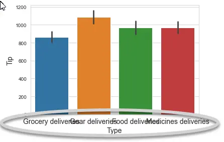
Here’s the result:

The axes ticks xticklabels are overlapping and not readable.
Rotate Matplotlib and Seaborn tick labels
The solution is relatively simple. We need to use the rotation parameter that is available for the pyplot.xticklabels method. For eachset of tick labels, you’ll need to specify the required rotation angle in degrees.
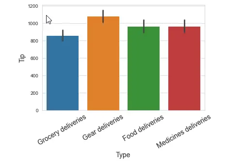
bar.set_xticklabels(labels, fontsize=14, rotation=30);You might want to use the ha parameter to horizontally align the label.
bar.set_xticklabels(labels, fontsize=14, rotation=30, ha= 'right');Here’s the updated chart:

The procedure to rotate and align the y axes is similar – just use the pyplot.set_yticklabels() method instead.
Tip: as you see, the chart is still somewhat small and not readable enough. If that’s the case, you can increase your plot size with ease.
This procedure is identical for lineplots, boxplots, catplots and heatmaps.